Thursday, December 31, 2009

Illustrator and InDesign: Khoua Eh Lee

Sneaking in one last post before the end of the year!
This piece is part of the final assignment in InDesign class. The student, Khoua Eh (pronounced Khooie) Lee created an illustrated book from Robert McCammon's short story Nightcrawlers, which became the best episode of the new Twilight Zone of the 80s (not to be confused with the new Twilight Zone of more recent years, hosted by Forrest Whittaker).
The story deals with Vietnam vets who... well, read it for yourself.  The link in the title above posts the whole story.
There's a very manic, nail-biting, edge-of your-seat sensation in both the story and the episode. While Khoua Eh's internal illustrations were not as successful as they might have been in conveying that sense, the cover, created in Illustrator CS3, does so admirably.


Khoua Eh is a student who moved into design from animation, and has made great strides as a designer in recent quarters. He's about to enter Portfolio class, which is a whole fresh challenge- but I think he's up to it!

Sunday, December 20, 2009

Photoshop: Jeffrey Bailey

As the quarter just ended, we'll take a break from the storyboards and present something else.
Once again, a success story from the movie poster assignment.
This is the work of Jeff Bailey, a design student who is about to enter the Portfolio class. Though this was done a couple quarters ago, Jeff revisited the piece as part of the Calendar design project in InDesign class.
Jeff is a very spritied and professional individual who just landed a paying internship in the design field!


Jeff completed this piece more than half a year before the documentary on Dr. Thompson was released, and he was unaware of the forthcoming documentary during the creation of this image! I find his use of the Find Outlines filter, combined with the stark,vibrant palette, very effective.
For use of the piece in his calendar, he deleted the credits, studio logo and ratings. I must say that it's a cleaner piece without that stuff, but it's crucial to recognize that in the field one does not have the option of omitting mandated copy!
For comparison's sake, here's the poster of the actual film:


A very different approach, but one more influenced by Jeff's favorite illustrator, Ralph Steadman.

Sunday, December 13, 2009

Storyboards: The Man Who Shot Liberty Valance, part 4 and whole board 1

The conclusion of the first board. I will speed up posting these, as at this rate, it will take me more than two months to do the whole thing!


It takes a bit of decoding, but it's possible to follow every move from these boards. The recurring problem is the overuse, sometimes inaccurate, of the term "full shot", which refers to a full-figure shot, also called a long shot.
Here's all of Board One.


Next week, the top tier of Board Two.

Saturday, December 5, 2009

Storyboards: The Man Who Shot Liberty Valance, part 3

More about this assignment:
After viewing the entire film, the students pick one scene of at least 5 minutes and prepare a full-pasteup board. This board shows every camera, character and object motion. It also documents every sound in the film. Essentially, they are dissecting a well-made film as a learning tool.
There is a facile aspect to this. I've been on enough shoots to know that the anlaytical aspects are often instinctive during the shoot, so looking at filmmaking form a theoretical viewpoint does not always apply. However, it's still useful to look at shot composition and continuity.
There are some technical errors on these boards, but most are minute. The most galring error is the misspelling of Rance Stoddard's name in the captions. Aside from having access to imdb.com, a source of record for film information, the students could have watched the movie more carefully, as the name is spelled out in big letters on screen in the story!
Ah well. A small concern, but one that would be embarrassing in a story meeting.
This week's panels:

Friday, November 27, 2009

Storyboards: The Man Who Shot Liberty Valance, part 2

These are the last two panels of the top tier of the first board. There are eight or nin boards in all.
The assignment was to deconstruct a scene from a classic film. Every action, object motion and sound was to be documented.
The clip had to be at least 5 minutes long, unless an exceptionally elaborate scene was chosen.
Left to their own devices, students will usually go for the most glamorous scene, the scene with the highest energy. Usually I try to back them away from such amibitions just a bit, but with Josh Purple on board, I thought "hm... maybe they can pull this off after all."
When the panels of each board have all been posted, the board will be posted as a unit.

Tuesday, November 24, 2009

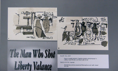
Storyboards: The Man Who Shot Liberty Valance, part 1

This one goes back quite a ways. This was the first truly successful project from one of my college-level storyboard classes. It is not without its problems, but given the subtleties and complexities of some of the  material, these guys just shined.
The team was Kelahir Johnson, Josh Purple, Ryan Fogarty, and Jason Tordsen, I believe.
More on their current activities in a later post.
Here are the title card and panel one from this very elaborate board.


I will have much more to say about the challenge of this project and how these students rose to it over the next few weeks!

Wednesday, November 4, 2009

Photoshop: Anthony Weis


This is as much about the layout as it is the control of Photoshop, which is as it's supposed to be.  This is a poster design for a fictional film of David Mack's Kabuki, one of the best designed comics of the last 20 years, and that's saying a lot!
This design is clean and effective but poses some intriguing challenges. The support text gets lost a bit in the white space, as it's light on light at that point. However, the polarizing solution, the inversion of the background color, offered below, makes the masks in the sun/Japanese flag less effective. I tend to prefer the white background, and want to find a way to resolve the text issue.
Consider the black background version below.


Anthony Weis is a challenging student, in the best way. He questions ideas, is eager to learn, works very hard and has a natural affinity for the arts as a discipline. He genuinely cares about developing a stronger aesthetic. He's also unusual in that he began his education training to be a pilot, and is double-majoring in digital art!

Saturday, October 24, 2009

addendum, Rob Cardinal

Strolling through Rob's Deviant Art site, I find he's posted his portrait shot for the class assignment.

What fascinates me about this image is the emotional impact it has on most people. In crit, we found ourselves composing stories about them, only to discover that Rob had just asked them and snapped their picture, and that he didn't even know them!
Shows just how much art really does come from interpretation, even when you're dealing with human beings as subjects and something as supposedly rooted in "reality" as photography.
But we know better.
Don't We?

Digital Photography: Rob Cardinal

I haven't posted here for a while, as I'm waiting for promised work from some students in a current class.
However, just to keep things moving, here's a digital photo by Rob Cardinal done for the Macro assignment.
Since I don't want to get into a rut and only post digital work here, I will find some past storyboards and post them very soon.
Rob trained as an animator, but decided his path lies elsewhere, and is beginning his career as a freelance photographer, specializing in Macro. He works as a prison guard for now, and is skilled, knowledgeable and driven. You can see a bit more of his moving work at his MNArtists page, which he sorely needs to update. Let's go, Rob!

Sunday, October 11, 2009

Photoshop: Tracey Logelin

Tracey is a talented designer with an eye for precision and aesthetics. Her work and her attitude were always very professional.
This piece was done for a very direct assignment, a thematic collage in Photoshop. She chose to forego the usual mundanities and explore a theme less travelled of late.


My only problem with it was that she used a satellite dish for an old time radio antenna! Still, the contrast of the sepia and the grayscale works well, and draws the warmth out of the cool grays.
Tracy is still hard at it. She graduated about a year and a half ago, and we had an e-mail exhange recently about issues around Web clients and designers.
Fpr more on Tracey, visit her MNArtists page.

Sunday, October 4, 2009

Graphic Design:Business card, Kou Lee


I can't recall which class Kou was taking when he created this work. I believe he had just completed Graphic Design and was in Pre-press.  I do recall commenting on his ideas.
This was submitted for a design contest. It won!
Kou just graduated. His body of work is substantial, versatile, controlled, elegant and quite impressive. Look for further postings of his work in weeks to come!
Until then, to see more of Kou's work, go to his impressive website, Magiq Umbrella.

Thursday, October 1, 2009

addendum, Matt Hensche

I posted this image as part of an announcement of this space on my personal blog.  However, the reduced color image was much too interesting to not re-post here. The light, the muted tones, the textures- all in all,  a very successful image.
Last I checked in with Matt, he was diligently working as a photo clerk at a job for which he's substantially over-qualified in every sense. Here's hoping his situation has improved. Anyone who combines such a strong aesthetic with such a fierce work ethic is entitled to commercial and creative success!


Matt Hensche, photography

Matt was a student in the first Digital Photo course I taught- has it been a year and a half already?
Always a keen eye and a solid work ethic, not to mention a quiet positive attitude, Matt's work has a confidence about it that invites the viewer in.


Wednesday, September 30, 2009

Welcome, students of all kinds

Hello!
The purpose of this blog is the presentation of the work of my students, from my various teaching positions.
The work will primarily be visual art, but on occasion I will post some student writing.
I will post no student work I was not given permission to post.
When comments are offered, I will attempt to make them positive.
I will also discuss the intricacies of the art and teaching businesses, as I understand them and am learning them as I live them.