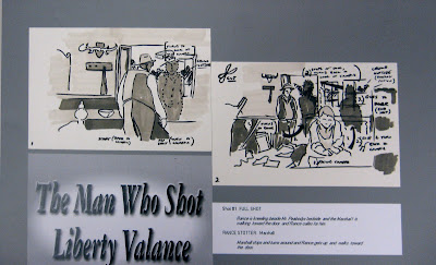
These are the last two panels of the top tier of the first board. There are eight or nin boards in all.
The assignment was to deconstruct a scene from a classic film. Every action, object motion and sound was to be documented.
The clip had to be at least 5 minutes long, unless an exceptionally elaborate scene was chosen.
Left to their own devices, students will usually go for the most glamorous scene, the scene with the highest energy. Usually I try to back them away from such amibitions just a bit, but with Josh Purple on board, I thought "hm... maybe they can pull this off after all."
When the panels of each board have all been posted, the board will be posted as a unit.
Friday, November 27, 2009
Tuesday, November 24, 2009
Storyboards: The Man Who Shot Liberty Valance, part 1
This one goes back quite a ways. This was the first truly successful project from one of my college-level storyboard classes. It is not without its problems, but given the subtleties and complexities of some of the material, these guys just shined.
The team was Kelahir Johnson, Josh Purple, Ryan Fogarty, and Jason Tordsen, I believe.
More on their current activities in a later post.
Here are the title card and panel one from this very elaborate board.
The team was Kelahir Johnson, Josh Purple, Ryan Fogarty, and Jason Tordsen, I believe.
More on their current activities in a later post.
Here are the title card and panel one from this very elaborate board.
I will have much more to say about the challenge of this project and how these students rose to it over the next few weeks!
Wednesday, November 4, 2009
Photoshop: Anthony Weis
This is as much about the layout as it is the control of Photoshop, which is as it's supposed to be. This is a poster design for a fictional film of David Mack's Kabuki, one of the best designed comics of the last 20 years, and that's saying a lot!
This design is clean and effective but poses some intriguing challenges. The support text gets lost a bit in the white space, as it's light on light at that point. However, the polarizing solution, the inversion of the background color, offered below, makes the masks in the sun/Japanese flag less effective. I tend to prefer the white background, and want to find a way to resolve the text issue.
Consider the black background version below.
Anthony Weis is a challenging student, in the best way. He questions ideas, is eager to learn, works very hard and has a natural affinity for the arts as a discipline. He genuinely cares about developing a stronger aesthetic. He's also unusual in that he began his education training to be a pilot, and is double-majoring in digital art!
Labels:
graphic design,
movie poster,
Photoshop,
students
Subscribe to:
Comments (Atom)


