I'm chagrined that I've not posted here for more than 3 weeks. As I'm teaching a humanities class and not studio courses this semester, I am posting older work again. I may post some of this quarter's papers, if they are strong enough.
This particular image is in response to the movie poster assignment. I suggested to Renardo (pronounced Renaldo) that he incorporate elements of Russian constructivism into his work on this one. He responded with a reduced palette, angeld type, and the line of silhouette figures grounding the image.
The posterization of the main images is quite effective. Given the way so many posters for these FX blockbusters are loud and over the top, this tightly controlled image and oh-so-clear typographic treatment are a welcome change of pace.
Renardo is a scary talented designer. His personal commitments make his course enrollment sproadic, but he alwasy delivers inspired, solid work. I look forward to seeing his professional progress!
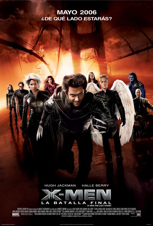
In the interests of contrast, here's one of the posters used for film's actual campaign. By contrast, louder and out of balance, certainly less appealing.
I hope to be a more faithful correspondent on this blog in the future!


No comments:
Post a Comment