Showing posts with label Photoshop. Show all posts

Monday, May 9, 2011

Photoshop: Josh Lemke

Been a while since I posted Photoshop work. I rediscovered these as I was sorting some files.
Josh Lemke was a very talented and driven student, somewhat out of his element in the more conservative environs of a for-profit college.
However, he was also a driven student and a driven artist.
When given the Photoshop assignment of an even poster, he designed three that function as a triptych.


the triptych seen as a single image

This piece (pieces?) succeeds on many levels. It stimulates interest in the event, it works from a range of distances, and echoes the sensibility of the subject matter.
However, it is not without its problems. The choice of font has issues, It's inconsistent with the Walker's identity. While a thick chunky font was required to make this work, this choice detracts a bit.
There's also the deliberate decision to omit the event dates. Josh's though on this was that it would increase interest in the poster(s) post-event.
However, the work succeeds on many more levels than those at which it does not.
After graduating, Josh worked at the school in question for a couple years, then moved on into mural painting, a discipline more in keeping with his ideology and art sensibility.
Josh with fellow artist Peyton Russell at the Gainseville, FL mural
I've since lost track of Josh, but I KNOW he's out there making great art!

Sunday, January 31, 2010

Photoshop: Markus Burke

Another approach to the movie poster assignment.
Markus is a deeply enthusiastic young man. His initial idea for this image incorporated a dozen small images and tried to tell the whole story of the film in one poster.
It didn't work.
After discussing his ideas, he came to an awareness of the power of suggestion.
He created an image that's about motion, energy and wild pacing.
Most significantly, he created an image that makes effective use of the program and says more with less.
 

There are still some legibility issues, and the novice's love affair with filters is evident. But Markus made giant strides in his understanding of design on this image.  
He learned that control of the tool is better than using it as a toy, at least if you aspire to be a professional.

Tuesday, January 19, 2010

Photoshop: Renardo McAffeee


I'm chagrined that I've not posted here for more than 3 weeks. As I'm teaching a humanities class and not studio courses this semester, I am posting older work again. I may post some of this quarter's papers, if they are strong enough.
This particular image is in response to the movie poster assignment. I suggested to Renardo (pronounced Renaldo) that he incorporate elements of Russian constructivism into his work on this one. He responded with a reduced palette, angeld type, and the line of silhouette figures grounding the image.
The posterization of the main images is quite effective. Given the way so many posters for these FX blockbusters are loud and over the top, this tightly controlled image and oh-so-clear typographic treatment are a welcome change of pace.
Renardo is a scary talented designer. His personal commitments make his course enrollment sproadic, but he alwasy delivers inspired, solid work.  I look forward to seeing his professional progress!

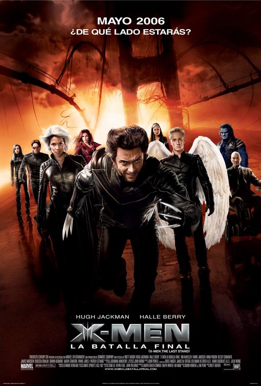
In the interests of contrast, here's one of the posters used for film's actual campaign. By contrast, louder and out of balance, certainly less appealing.
I hope to be a more faithful correspondent on this blog in the future!

Sunday, December 20, 2009

Photoshop: Jeffrey Bailey

As the quarter just ended, we'll take a break from the storyboards and present something else.
Once again, a success story from the movie poster assignment.
This is the work of Jeff Bailey, a design student who is about to enter the Portfolio class. Though this was done a couple quarters ago, Jeff revisited the piece as part of the Calendar design project in InDesign class.
Jeff is a very spritied and professional individual who just landed a paying internship in the design field!


Jeff completed this piece more than half a year before the documentary on Dr. Thompson was released, and he was unaware of the forthcoming documentary during the creation of this image! I find his use of the Find Outlines filter, combined with the stark,vibrant palette, very effective.
For use of the piece in his calendar, he deleted the credits, studio logo and ratings. I must say that it's a cleaner piece without that stuff, but it's crucial to recognize that in the field one does not have the option of omitting mandated copy!
For comparison's sake, here's the poster of the actual film:


A very different approach, but one more influenced by Jeff's favorite illustrator, Ralph Steadman.

Wednesday, November 4, 2009

Photoshop: Anthony Weis


This is as much about the layout as it is the control of Photoshop, which is as it's supposed to be.  This is a poster design for a fictional film of David Mack's Kabuki, one of the best designed comics of the last 20 years, and that's saying a lot!
This design is clean and effective but poses some intriguing challenges. The support text gets lost a bit in the white space, as it's light on light at that point. However, the polarizing solution, the inversion of the background color, offered below, makes the masks in the sun/Japanese flag less effective. I tend to prefer the white background, and want to find a way to resolve the text issue.
Consider the black background version below.


Anthony Weis is a challenging student, in the best way. He questions ideas, is eager to learn, works very hard and has a natural affinity for the arts as a discipline. He genuinely cares about developing a stronger aesthetic. He's also unusual in that he began his education training to be a pilot, and is double-majoring in digital art!

Sunday, October 11, 2009

Photoshop: Tracey Logelin

Tracey is a talented designer with an eye for precision and aesthetics. Her work and her attitude were always very professional.
This piece was done for a very direct assignment, a thematic collage in Photoshop. She chose to forego the usual mundanities and explore a theme less travelled of late.


My only problem with it was that she used a satellite dish for an old time radio antenna! Still, the contrast of the sepia and the grayscale works well, and draws the warmth out of the cool grays.
Tracy is still hard at it. She graduated about a year and a half ago, and we had an e-mail exhange recently about issues around Web clients and designers.
Fpr more on Tracey, visit her MNArtists page.