Sunday, January 31, 2010

Photoshop: Markus Burke

Another approach to the movie poster assignment.
Markus is a deeply enthusiastic young man. His initial idea for this image incorporated a dozen small images and tried to tell the whole story of the film in one poster.
It didn't work.
After discussing his ideas, he came to an awareness of the power of suggestion.
He created an image that's about motion, energy and wild pacing.
Most significantly, he created an image that makes effective use of the program and says more with less.
 

There are still some legibility issues, and the novice's love affair with filters is evident. But Markus made giant strides in his understanding of design on this image.  
He learned that control of the tool is better than using it as a toy, at least if you aspire to be a professional.

Sunday, January 24, 2010

Thoughts on studio vs. Liberal Studies classes

As I'm not teaching studio this quarter/semester (my schools are on different systems), I find I muse of late on the implications of that.
What are the advantages of one over the other, from a teacher's standpoint?
I love teaching ideas. The value of what's being done has to be part of doing it, and if what you're doing doesn't stand up to some measure of scrutiny, then it's just busywork. So studio courses clearly need a humanities/ liberal arts framework.
But ideas require context, and ideas about art need the context of the art itself. While it can be a self-conscious process, an awareness of the history and theory of the discipline in which one works can, and ought to, inform the work.
Any studio teacher worth their salt must incorporate some theory into their teaching. In order for a drawing to be most effective, it must incorporate design considerations, mathematical principles and a measure of psychological insight. Communicating that to a student, especially a novice, is challenging, to say the least. Students at that level often tend to take a defeatist tack- "I can't do that!" The studio teacher's challenge is to get them out of their own heads and into the work itself.
The humanities teacher, on the other appendage, must of necessity be a bit of a pedagogue. The implicit didact in this position has a measure of necessity. While ideas are fluid, core principles underlying those ideas form a foundation that is crucial to the successful absorption of any of the ideas presented in a humanities class. So the didactic position is necessary to get the work started, to say nothing of completed, if any such work can be said to be complete.
As I prepare for the paradigm shift of going from the digital arts studio back into the lecture hall as a primary arena for the first time in more than half a year, I find my thoughts turning to these concepts.
There's an associated, more universal concept, that I got from an early teaching mentor, William Wells.
We can't teach them anything.
All we can do is show them. It's up to them to learn.
This is both a sadness and a liberation, and applies equally to the studio teacher, the humanities teacher- any teacher.

Tuesday, January 19, 2010

Photoshop: Renardo McAffeee


I'm chagrined that I've not posted here for more than 3 weeks. As I'm teaching a humanities class and not studio courses this semester, I am posting older work again. I may post some of this quarter's papers, if they are strong enough.
This particular image is in response to the movie poster assignment. I suggested to Renardo (pronounced Renaldo) that he incorporate elements of Russian constructivism into his work on this one. He responded with a reduced palette, angeld type, and the line of silhouette figures grounding the image.
The posterization of the main images is quite effective. Given the way so many posters for these FX blockbusters are loud and over the top, this tightly controlled image and oh-so-clear typographic treatment are a welcome change of pace.
Renardo is a scary talented designer. His personal commitments make his course enrollment sproadic, but he alwasy delivers inspired, solid work.  I look forward to seeing his professional progress!

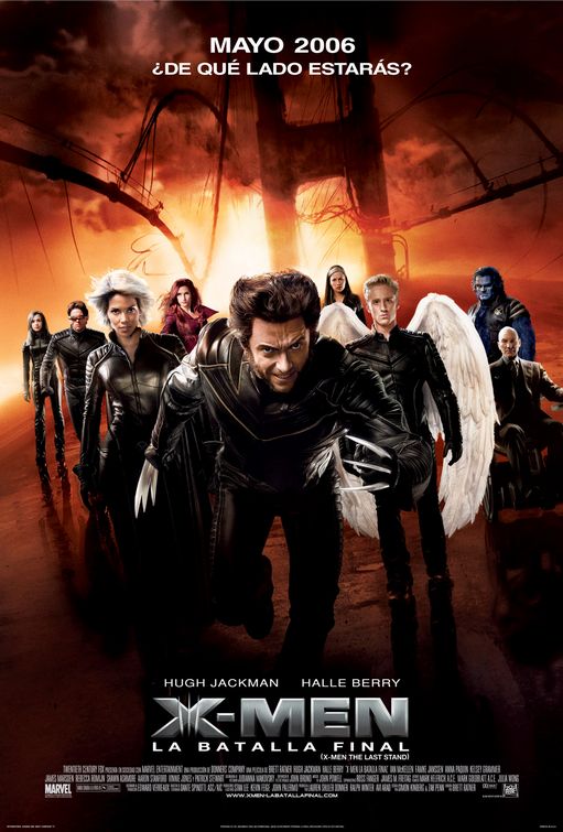
In the interests of contrast, here's one of the posters used for film's actual campaign. By contrast, louder and out of balance, certainly less appealing.
I hope to be a more faithful correspondent on this blog in the future!

Thursday, December 31, 2009

Illustrator and InDesign: Khoua Eh Lee

Sneaking in one last post before the end of the year!
This piece is part of the final assignment in InDesign class. The student, Khoua Eh (pronounced Khooie) Lee created an illustrated book from Robert McCammon's short story Nightcrawlers, which became the best episode of the new Twilight Zone of the 80s (not to be confused with the new Twilight Zone of more recent years, hosted by Forrest Whittaker).
The story deals with Vietnam vets who... well, read it for yourself.  The link in the title above posts the whole story.
There's a very manic, nail-biting, edge-of your-seat sensation in both the story and the episode. While Khoua Eh's internal illustrations were not as successful as they might have been in conveying that sense, the cover, created in Illustrator CS3, does so admirably.


Khoua Eh is a student who moved into design from animation, and has made great strides as a designer in recent quarters. He's about to enter Portfolio class, which is a whole fresh challenge- but I think he's up to it!

Sunday, December 20, 2009

Photoshop: Jeffrey Bailey

As the quarter just ended, we'll take a break from the storyboards and present something else.
Once again, a success story from the movie poster assignment.
This is the work of Jeff Bailey, a design student who is about to enter the Portfolio class. Though this was done a couple quarters ago, Jeff revisited the piece as part of the Calendar design project in InDesign class.
Jeff is a very spritied and professional individual who just landed a paying internship in the design field!


Jeff completed this piece more than half a year before the documentary on Dr. Thompson was released, and he was unaware of the forthcoming documentary during the creation of this image! I find his use of the Find Outlines filter, combined with the stark,vibrant palette, very effective.
For use of the piece in his calendar, he deleted the credits, studio logo and ratings. I must say that it's a cleaner piece without that stuff, but it's crucial to recognize that in the field one does not have the option of omitting mandated copy!
For comparison's sake, here's the poster of the actual film:


A very different approach, but one more influenced by Jeff's favorite illustrator, Ralph Steadman.

Sunday, December 13, 2009

Storyboards: The Man Who Shot Liberty Valance, part 4 and whole board 1

The conclusion of the first board. I will speed up posting these, as at this rate, it will take me more than two months to do the whole thing!


It takes a bit of decoding, but it's possible to follow every move from these boards. The recurring problem is the overuse, sometimes inaccurate, of the term "full shot", which refers to a full-figure shot, also called a long shot.
Here's all of Board One.


Next week, the top tier of Board Two.

Saturday, December 5, 2009

Storyboards: The Man Who Shot Liberty Valance, part 3

More about this assignment:
After viewing the entire film, the students pick one scene of at least 5 minutes and prepare a full-pasteup board. This board shows every camera, character and object motion. It also documents every sound in the film. Essentially, they are dissecting a well-made film as a learning tool.
There is a facile aspect to this. I've been on enough shoots to know that the anlaytical aspects are often instinctive during the shoot, so looking at filmmaking form a theoretical viewpoint does not always apply. However, it's still useful to look at shot composition and continuity.
There are some technical errors on these boards, but most are minute. The most galring error is the misspelling of Rance Stoddard's name in the captions. Aside from having access to imdb.com, a source of record for film information, the students could have watched the movie more carefully, as the name is spelled out in big letters on screen in the story!
Ah well. A small concern, but one that would be embarrassing in a story meeting.
This week's panels: